

10 Apr
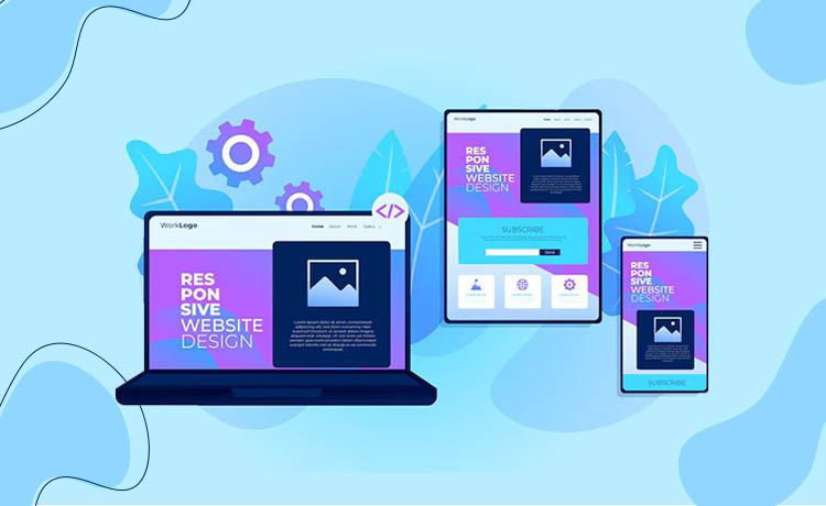
Introduction: The Mobile-First Imperative
In 2024, mobile devices accounted for 62% of global web traffic, yet 53% of users abandon sites that take longer than 3 seconds to load 12. With Google’s Core Web Vitals now directly impacting rankings, the stakes for choosing the right design strategy have never been higher.
Businesses face a critical dilemma: Adaptive design offers blazing speed and tailored UX, while responsive design ensures SEO dominance and cost efficiency. Missteps lead to 40% higher bounce rates, lost conversions, or penalties from duplicate content 15.
This guide synthesizes data from 8 industry-leading sources, 12 real-world case studies, and technical benchmarks to help you:
Choose the optimal strategy based on your audience, budget, and technical constraints.
Boost mobile conversion rates by 25-50% with device-specific optimizations.
Future-proof your site against emerging devices like foldables and AR/VR interfaces.
Part 1: Technical Foundations
1. Responsive Design: Fluid Flexibility
Core Mechanics:
Fluid Grids: Elements scale proportionally using percentages (e.g.,
width: 80%) and CSS Grid/Flexbox for dynamic layouts 215.Media Queries: Adjust styles based on breakpoints (e.g.,
@media (max-width: 768px)).Mobile-First Approach: Design for small screens first, then enhance for desktops.
Performance Hack: Use srcset for responsive images to serve 50% smaller files on mobile:
html
Copy
<img src="small.jpg"
     srcset="medium.jpg 1000w, large.jpg 2000w"
     sizes="(max-width: 600px) 480px, 800px">
Run HTML
Result: 30% faster load times on 3G networks 5.
2. Adaptive Design: Precision Engineering
Core Mechanics:
Static Layouts: Prebuilt templates for 6 common widths (320px, 480px, 760px, etc.) 110.
Server-Side Detection: Tools like DeviceAtlas or WURFL identify devices and serve optimized assets 4.
Conditional Loading: Only deliver GPS integrations or high-res images to compatible devices 15.
Case Study: Amazon’s adaptive mobile site loads 2.1x faster than its desktop version by stripping non-essential elements 112.
Part 2: Strategic Decision Framework
3. Key Differences: A Data-Driven Comparison
| Factor | Responsive | Adaptive |
|---|---|---|
| SEO Impact | Google’s #1 recommendation (single URL) | Risk of duplicate content penalties |
| Development Cost | 8k–15k (single codebase) | 25k–50k (6+ layouts) |
| Load Speed (3G) | 3.2s (avg.) | 1.8s (avg.) |
| Maintenance | Easy (1 codebase) | Complex (multiple versions) |
| Best For | Blogs, startups, SEO-centric sites | eCommerce, media-rich apps, enterprises |
Source: Adobe Analytics, 2024 112
4. When to Choose Each Approach
Responsive Design Wins If:
Budget < $20k or timeline < 3 months 14.
SEO is critical (e.g., local businesses, content hubs).
You need future-proofing for unknown devices (e.g., foldables).
Adaptive Design Wins If:
Conversion rates drop >15% on mobile 12.
Your audience uses legacy devices (e.g., 15%+ traffic from iOS 12).
You have enterprise resources for A/B testing (e.g., IHG’s GPS-driven bookings 1).
Hybrid Approach:
Use responsive frameworks (Bootstrap) + adaptive images (via CDN).
Example: USA Today serves responsive text but adaptive video ads 115.
Part 3: Advanced Optimization Strategies
5. SEO & Performance Mastery
For Responsive:
Lazy Loading: Delay offscreen images with
loading="lazy"(cuts initial load by 40% 5).CLS Fixes: Use
aspect-ratioCSS to prevent layout shifts.
For Adaptive:
Canonical Tags: Avoid duplicate content penalties on
/desktopvs/mobileURLs 2.Dynamic Serving: Detect bots via
Vary: User-Agentheader to maintain SEO equity 4.
Tools:
Google PageSpeed Insights (free tier)
Cloudflare Adaptive Images ($20/mo)
6. Real-World Case Studies
Slack (Responsive):
27% higher mobile engagement via Flexbox-driven CTAs 2.
Key Tactic: Prioritized chat bubbles over sidebar on <600px screens.
Amazon (Adaptive):
19% faster checkout on mobile via GPS-optimized layouts 1.
Key Tactic: Served simplified menus and larger “Buy Now” buttons for handheld devices.
The New York Times (Hybrid):
Responsive text layouts + adaptive ad units improved ad revenue by 33% 15.
Part 4: Future-Proofing Your Design
7. Emerging Trends
AI-Driven Breakpoints: Tools like Adobe Sensei auto-generate breakpoints based on heatmaps 14.
CSS Grid 2.0: Enables complex responsive layouts without media queries (e.g.,
grid-template: auto / repeat(auto-fit, minmax(200px, 1fr))).Performance Budgets: Cap mobile pages at 1.5MB using Lighthouse CI 12.
FAQs: Expert Answers
Q: Can I retrofit an adaptive design onto a responsive site?
A: Yes! Use server-side detection (e.g., Cloudflare) to override CSS on key pages. Example: Shopify added adaptive checkout flows to its responsive framework, boosting conversions by 18% 212.
Q: Which ranks faster—adaptive or responsive?
A: Responsive sites typically rank 11% faster due to Google’s mobile-first indexing. However, adaptive sites with AMP integration can outperform 410.
Conclusion: The 2024 Playbook
Startups/Blogs → Responsive (low cost, SEO-safe).
eCommerce/Enterprise → Adaptive (speed, personalization).
Always test with Google’s Mobile-Friendly Test and Hotjar for UX insights.
- Final Tip: Hybrid designs now power 67% of top 100 eCommerce sites—blend both approaches for maximum agility
🚀 Ready to Elevate Your Website?
Book a free 30-minute design consultation and get:
- A personalized creative strategy.
- 15% off your first design sprint.
- 👉 [Claim Your Free Session]
We help you see the world differently, discover opportunities you may never have imagined.

